Fashion or Family photography???

I was not  a big fan of fashion photography,but I decide to be open for challenge.Until now…I did try my best have fun work with great team,is not as easy as it look.I never knew that so many people is behind the scene.

Family photography though. I am honoured every time when I am given opportunity to take a picture of that tiny precious new life. The sessions could take a long time,sometimes Im covered (how to say this nicely?) body fluids…but I don’t care Love it!!!

Don’t be a dummy! Make a dummy book

I had so much fun of making a photo book dummy.

Project I decided to use was my street life “Reflections”.

I did struggle with idea for  street life project at the beginning.I couldn’t find my place at the street. After first tutorial  all of my previous ideas ware shaped away by my tutor,as I thought reflections will be popular one I didn’t want to do it. I kind of try to forget about it as thought that will be “taken” I was very surprise when my tutor gave me green light. I did had a good time making that project.I did prototype of my dummy book and submitted with one of previous Unit 4, but that one is nothing special just simple paper and photos.

I did project last year  about “London today” and my project was a “Reflections” around London.I did print Photobook from that project with  Blurb you can buy it on Amazon ;).This time instead famous landmarks I did photographed people.Still I think they complemented each other like is book part 1 and part 2.

In both of my dummy books I did use acetate to print my images on. I did like idea to use transparency with mirror type of subject place with them.

First one, print onto acetate and mirror card behind each image. Together the made very playful book as they reflecting and distorting image depend how you open it.On the front cover I did made stencil cut out letters and use metallic spray to make title.

Second one was  bigger challenge, again I did use acetate to print my image onto,but this time i did spray metallic spray at the back of it.I did acordeon  type of book to keep that playful fell to it.Each image is been stick to the page by photo corners stickers to give me flexibility to change around  the order they appear in the book, it is a dummy book after all.

Unfortunately I wasn’t able to print this book professionally as this kind of book doesn’t fit in usual standards…

The clouds are balls of cotton…

“This assignment is about understanding and interpreting ideas in a metaphorical way.

A metaphor is the representation of a person, place, thing, or idea by using visual language that suggests a particular association or point of similarity. Modern advertising relies heavily on visual metaphors “the high-performance jet fighters of creative communication”, commonly thought as fast powerful and effective. For this mini assignment it is suggested that you use metaphors in your photography. Your intention is to produce images interpreting the theme “Friends for dinner” in your own individual way. Choose your objects/subjects so that you photographs mean something different than the obvious. Remember that simplicity can add strength to your images. Experiment with light and composition in order to reinforce the look of your photos so that you deliver the intended message. Think of a visual metaphor as a way of envisioning your subject.”

I did invited friends for diner…or maybe a tea… Inspired by my daughter role playing

Unexplained shadows

This unit was unexpected treat, not unexplained shadows…

I did learn a lot in such short amount of time discovered techniques I never knew they existed.I only wish we have more time…

 Cyanotype is a contact print process and you will need a negative the same size as the size of the print you want. A cyanotype with a blue image on a white background is obtained using a negative transparency. In order to obtain a pale white image on a blue background, a positive transparency must be used. Cyanotypes are created with a simple solution of ferric ammonium citrate and potassium ferricyanide.

The cyanotype emulsion is sensitive to ultraviolet light. Therefore either sunlight or another UV light source must be used for exposure. For consistent results, a UV light box is recommended, or when is sunny you can take it outside.

Lately me and my printer…are not best buddies so I couldn’t print digital negative but I did have some images from different project printed as positive image on acetate and I like effect more than digital negative.

Darkroom time

I don’t know where to start…Darkroom was always special journey for me and it was like that this time as well.
That wasn’t my first time in darkroom, but I can say it feels like it was, I learnt a lot. Im confident to develop film using different developers, I did develop few different types of films. Im confident to print, and try different toners, and learn how to make my print to exhibition level.

Plan A
I saw work of Ziad Antar ‘Expired” in Paris photo and my first impression was that was digital “layer” after conversation with guy in his gallery i found out that he used expired film.I was amazed what effect he got I wanted to try it.

Idea was to have set of portraits in very low light like spot light with some creative shadows on subject  that didn’t work out for two reasons first of all i didn’t have lighting needed, second of all my film was expired but only 5-6 years and to get that effect you need film from 1970-1975.

Plan B
I sill wanted to carry on with expired film, this time i decide I will double expose portraits. For that i used ordinary b&w film and take first part of photos portraits. Sequin part was to add as second exposure, some layer with person characteristic items,or interest (like magazine covers of their hobby,children book etc.)and that part was supposed to be on expired film and had “reticulation effect” but i try my best…to kill that negative but had no luck I got kodak from 1973 and develop in hot stop cool down in cold fix no effect.

Plan C
As I was running out of time and paper I decide to convert my digital files to film. That was not as easy as I thought would be … I was advise by guy from First call to put my film on ISO 100, I wouldn’t make that decision now, as took very long time to expose (256s) and I had problem with getting details on highlights.I did pre-flash my paper before exposing it and finally things started to falling  into  wright place.

Final work from darkroom unit

Ideas and concept…

I never expected that I will enjoy this unit so much. Ideas and concept?What you can learn about that was my thinking,at the beginning of the Unit. This unit open my eyes to different types of art work, I never look at paintings, I mean I did but never analysed them. I find a lot of inspirations now in paintings after this unit that is my starting point. In photography everything was seen before, when comes to paintings I see know how much time take to paint something,it is exactly the same when you have your time to decide about your project( you think more your imaginations work more and you more open) I did change my mind couple of times for my mini assignments as well as for main major project.

Photomontage I was very happy about the fact we could do manual photomontage, I wanted to do 3D piece after I seen amazing work in National Gallery. My idea was to make room out of box, not any room I wanted to create ballet class studio. Most of Thursdays when we have our lessons, above us ballet class have rehearsals, I see dancers around collage as well, first impression when you look at them is they so skinny and fragile. The noise they making is impossible to match with  people . I try to imagine how that room looks like and made box with little ballerina inside.

When I was showing my box to class, one person sitting behind box, after I was talking about my work  was under impression that she will see elephant in box ( as I refer to them explaining what kind of noise they making) I took that on board,and as much as I enjoyed manual photomontage I took it to Photoshop. Decide to re do my task so I still did ballerina with head and feet of elephant with big belly. Lesson learnt if the first plan doesn’t work out be prepare to work harder to get wanted result…I did enjoyed doing it and Im happy with result.

Surrealism I did decide to take on very personal subject. I did research and find inspiration in paintings of Rene Magritte. When I look at clouds they make me calm, I remembered my childhood when we were guessing what shapes clouds make.We no longer look up we look around us in front of us but not often above us. We all have somebody we lost…family member or friend…when I can’t stand world around me I look up, and I have that little moment…that somebody is watching over me encourage me not to give up and carry on. I had this image in my head for a while now. I don’t thing that my little audience got the massage. I was true to myself, that was very personal surrealistic work for me…

“At the cutting Edge “
I started with different idea and because of the brainstorm in class the other day, my colleagues push me to direction I wasn’t sure I wanted to go,I was scared to go.I couldn’t stop thinking about it, and maybe because is so personal this become my special  project that I put my heart to it…

 Starting Points

Crystal Shawanda                                                             Gertrude Käsebier: Silhouette

“You Can Let Go”

Screen Shot 2015-06-28 at 20.16.23

 I decide to interpret my chosen artwork.
The song is special story between daughter and her father…I would love to achieve emotions,pictures showing different part of life, and that special relationship…

This slideshow requires JavaScript.

Street life reflections

I did struggle with that project idea. I did have few different ones but didn’t come to approval on first tutorials.

I was well out my comfort zone…I find difficult to approach strangers especially with my precious camera and lenses (£££) always afraid somebody will damage that if they not happy with me taking photo of them. I had to come up with idea to make project possible. I thought about reflections… as people don’t really pay attention what is happening around them, as long is not in front of their face.

Reflections was my best choice! After finally finding the idea I went for the streets. During half therm I had visitors, so I could go out in evening (baby siting wasn’t issue for once) I went out for 3 nights,but only came out with few good photos. The most difficult part was to had 15 photos. I went out for few more days. Finally when I thought I was done and proud of my work…we had workshop with Lewis Bush , he killed some of my babies,and I was short again. I did go out again. Im glad that some of my pictures was edited out as that make my project stronger.
I did enjoy myself,I didn’t expect that… My approach to street photography was careful one I can put myself in quiet type of street photographer…

The same but different??? DIVERSITY!

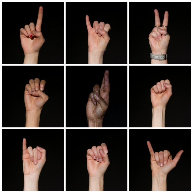
I did miss session on the subject, so was more difficult for me to come up with the idea. I played with words “same but different” I knew that need to be 9 pictures and I come up with world “DIVERSITY” 9 letters perfect, then strait away I thought hands…and sign language.

Lucky for me we have easy access to Mark ( sigh language interpreter)I ask him to spell the world for me, what a disappointment… he did use two hands to do it. I already had idea in my head how the picture will look like (and in my head that was one hand). He did point me to write direction, saying that is UK sign language way of spelling but in US sing language they spell with one hand, after little research I knew what I was looking for, again consulted Mark if that make sense. After Mark’s approval, one day in studio I ask my colleagues to pose for me. I did use black background one snoot light coming from above in front of subjects hands.
I have strong message behind my project as we all are the same as humans (Anatomically) but we are different but still work as a group of different types.

The format of typology made my project work, as is not just alphabet there is secret message in word ‘DIVERSITY’ so if that will be on gallery wall ( theoretically ) somebody will have to stop and look to see and without explanation this is just the picture of hands.

Diversity

Typology

I had few different ideas, first one I did was ok, but only ok. I wanted to get something at least little interesting, as I’m sorry to say Typology is not my thing. I shoot my first set of 25 pictures of different shades of fabric (one used for patch work) but that was nothing special about it.I did shoot that before tutorial day, before we needed to do proposals, when come to writing the proposal there was question “What massage you want to put through your typology work?” and the answer was …nothing really… nice fabric? as I struggle with that question I decided to shoot something different. That is my first attemt I was not to happy about it…like you can be happy about typology… First attemt... My lovely neighbours house was my “treasure box” so I ask them for something…believe me I could shoot typology for all class mates from the items they have.After careful consideration and counting amount of subjects I decide to take pictures of little dolls house accessories. I had clear massage behind it, when you retire you try to find crazy things to do…every single item on my typology been hand made by lovely couple (78 and 76 years old) Sadly they are selling house and moving away, I thought will be nice to give them pictures after project, and also have something for myself to remember them by. The final format of typology worked very well for my subject.I did them in two different grid and I think as typology the pictures make more sense and look interesting more that if the ware shown as separate snaps. Main typology Typology